

A widespread misconception with business–to–business (B2B) sites is that they are immune to rules and usability standards that apply to ecommerce on business–to–consumer (B2C) sites. In fact, B2B design teams should account for their users’ needs and follow usability principles to address customer concerns and build trust. The business professionals who use B2B sites also shop on plenty of B2C sites, and Jakob’s Law of the Internet User Experience states that people will form their expectations from the majority of sites they visit. Common ecommerce UX recommendations help B2B web-design teams to build trust with their users.
Unique B2B Constraints
Many of the same UX principles that organizations employ to build customer trust in B2C sites can also be applied to B2B. However, B2B consumers often have additional constraints compared to their B2C counterparts:
- High switching costs: Often, companies must get out of another contract with a competitor in order to purchase a B2B product. The relative “cost” of switching to a new organization for a service or product can be high due to:
- Termination costs, which impose a termination fee or some other financial penalty for terminating a contract
- Data costs, in the form of lost access or privileges, if the customer switches to a new service provider
- Transfer costs of moving legacy items (data, files, materials, cases, people, etc.) to the “new” provide
- Purchase complexity: Even if a site makes the purchasing process extremely easy, the buyers are often getting more than just a product — they are getting additional value such as services, maintenance, and support. These aspects make the decision complex, even in the best-case scenario. The complexity of the decision means it requires a lot of working memory and knowledge — in other words, a high cognitive load.
In this article, we will discuss how to build lasting customer relationships with B2B consumers by effectively addressing unique considerations in three categories:
B2B Budgets & Pricing
Much like their B2C counterparts, B2B customers are usually price-conscious. However, B2B budgets can be more difficult to deal with than personal budgets because they are:
- often set by a manager or by other senior colleagues rather than by the person who is researching or purchasing the product
- approved and not revisited for a year or more
- complex because they include elements such as long-term support or maintenance services along with the purchase
Imagine a B2B consumer who does her research and gets budget approval, but, after talking to sales, determines that a different, more expensive solution would be a better choice than the one identified initially. She may not have the power to increase the budget or it may take a fiscal year to do so. Due to these challenging budget constraints, B2B consumers need to know that their purchasing decision will not result in unforeseen expenses somewhere down the line.
An organization must be clear about prices in B2B environments in order to reassure users that the company acts transparently. In fact, the first site to show a price can anchor users’ expectations.
On the other hand, many B2B sites strive to avoid setting the wrong expectations and, instead, attempt to drive leads by keeping all prices hidden and encouraging users to “request a quote” or “contact sales” to get a starting price. However, this strategy of hiding prices deters users because it:
- Adds an extra step, thereby increasing the overall interaction cost of finding the price. This extra effort may cause users to leave the site to research prices.
- Makes it seem unaffordable (no matter what the person’s budget is). As the old adage goes, “If you have to ask… it’s probably too expensive.” Hiding the price can give the impression that it is “too scary” to be displayed. Even if that may be the case, users will have to learn the price at some point anyway, so hiding it will only worsen the eventual sticker shock (especially if they are anchored to a different starting price — say, from a competitor).
- Makes the organization seem dubious for the simple reason that it is hiding something from users.
Recommendations
Show the price; and if the price is variable, offer common pricing scenarios.
Perhaps the price is variable due to reasons such as complex solution options or even contract negotiations. To give an idea of price without setting unrealistic expectations, show common pricing scenarios. For example, display a starting price (which can be upgraded based on requirements) or a range of prices.
Clearly explain the pricing model (i.e., plans, packages, or tiers of service).
Capitalize on the principle of loss aversion by showing users what extra features the more-expensive packages include. This approach encourages people to purchase a slightly more expensive package if they have wiggle room in their budgets.
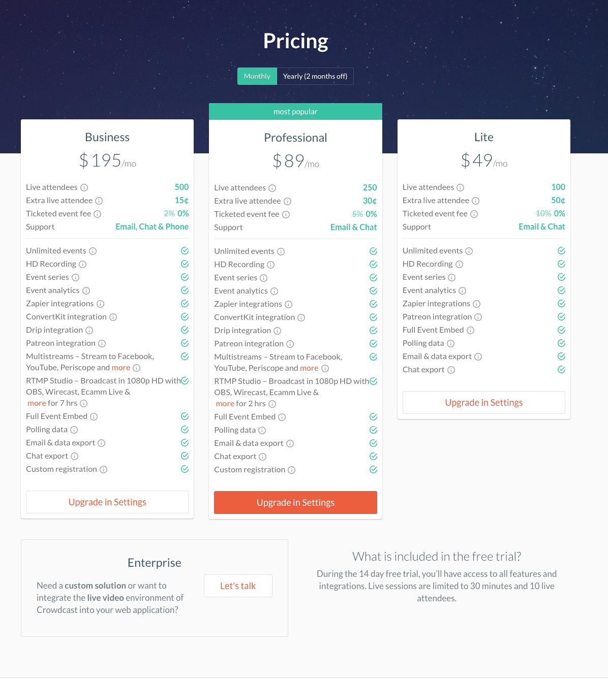
Crowdcast.io, a browser-based webinar platform, describes three tiers of service, listed in a comparison table. For easy evaluation, the features are listed in the same order in each column, so users can easily see which plan has the most and the least features and which features are present in a plan.
The site also offers an Enterprise option, in the lower-left corner of the page. This option makes it possible for an organization with specific, less-standard needs to obtain a custom solution. The variety of pricing plans demonstrates Crowdcast.io’s flexibility
If customization is possible, make it clear. Explain what is customizable upfront.
Clearly indicate what kind of customization is available when you list your prices. Call out features that can be customized in order to manage expectations early in the research phase. The “perfect custom solution” probably means different things to different customers. Failing to manage expectations risks overpromising and underdelivering, thus ruining the customer’s trust in the organization.
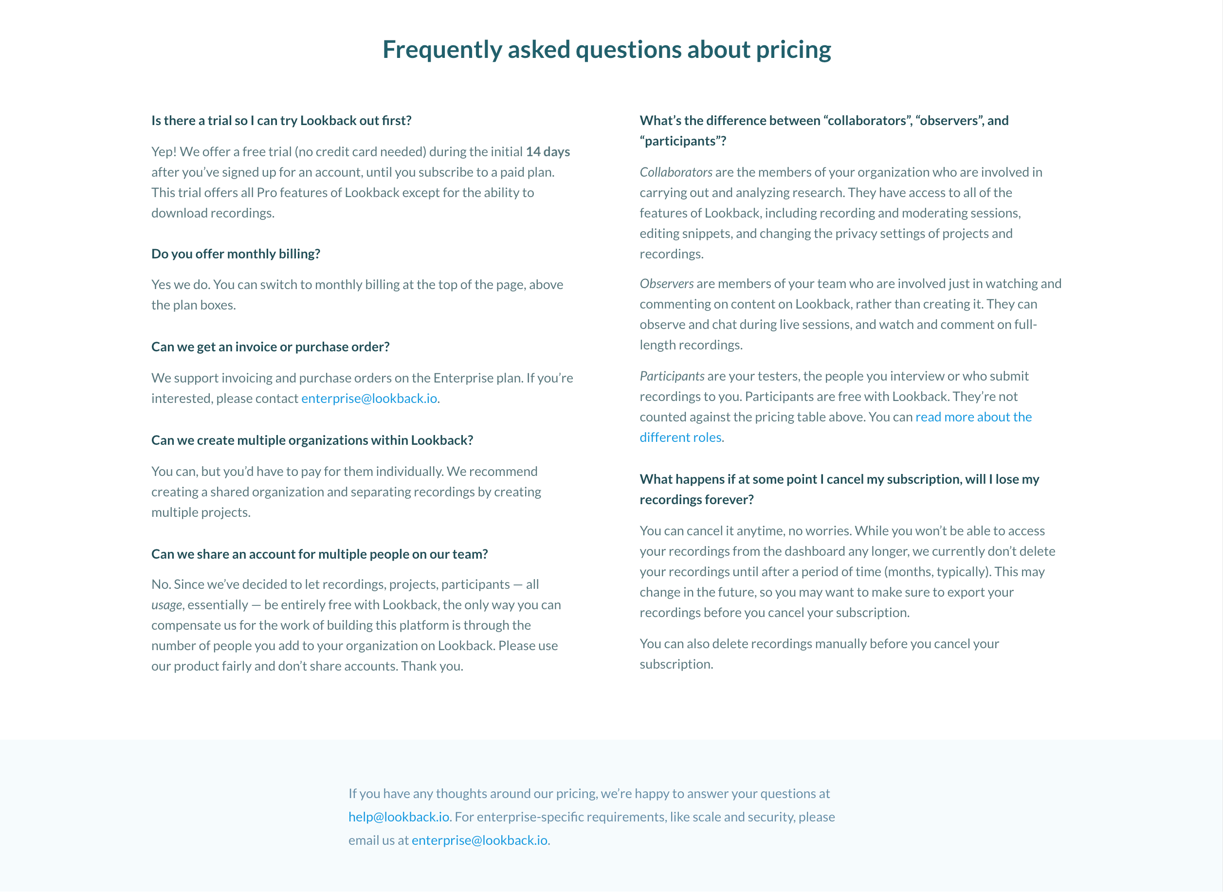 Lookback.io’s pricing page lists frequently asked questions about pricing models for specific features. The page also reassures users by providing specific email addresses to contact with additional concerns.
Make it easy for people to compare plans.
Use tools like comparison tables to show which services come with each plan or product. Using numeric values and iconography (such as a checkmark or “x”) can indicate if a plan is missing certain options. By clearly explaining what is and is not available in each tier or plan, the company is transparent and upfront, building trust in the organization.
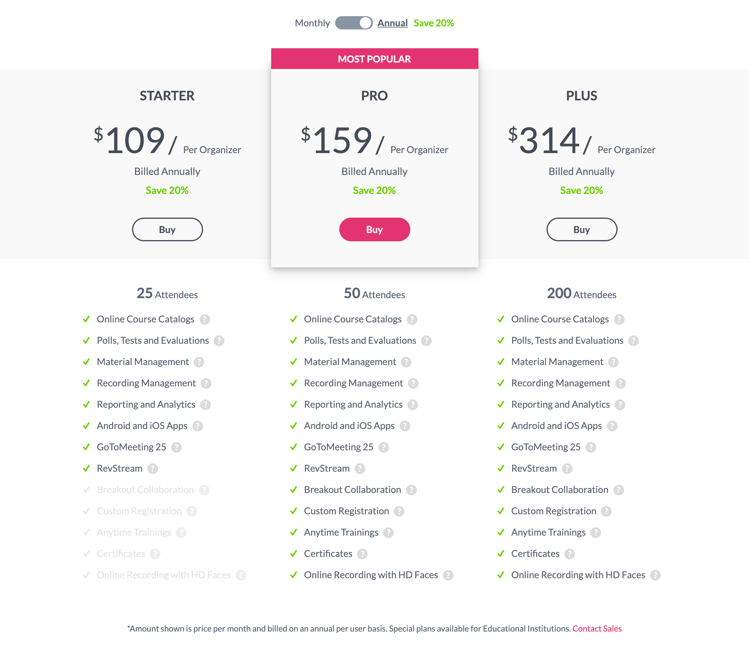 GoToTraining.com: The Most Popular plan suggestion helps users who may struggle with deciding which is the best option. The page also isolates the essential difference among plans — the number of attendees that can participate in a meeting (25, 50, and 200 Attendees). However, using low-contrast text for features not available with the Starter plan, risks legibility and discoverability. A better alternative would be high-contrast text with distinguishable iconography (rather than using faded checkmarks on features which are not available).
Address concerns about costs of switching from a competing product or service.
As mentioned above, B2B consumers often have switching costs to consider in addition to the product’s price. While these costs are inevitable, B2B teams can ease that concern by promoting services or offers that directly reduce the financial and interaction costs of switching (for example, covering termination fees or offering migration assistance). Including this information on FAQ pages or on pricing pages can alleviate stress and bolster trust in the company.
Contact with a Sales Representative
Even if your website provides plenty of information, some B2B consumers will need to contact sales to get information on use cases, ask specific support questions, send a list of requirements, or, in the best case, move forward with a contract with the organization. However, there is often an inherent and legitimate fear that the sales representative will:
- be pushy
- attempt to upsell
- promise something that cannot be delivered
These concerns add to the stress of contacting a sales rep. Purchasers must have trust in the company early in the process in order to feel comfortable to follow through and contact the company.
Similarly, sales representatives often need to gather information about each user’s needs in order to answer these open questions, tailor the order, initiate a contract, or offer a better deal. To do this, a B2B firm usually needs to ask for personal information (like contact information) or company information (as broad as industry information and as specific as company address or department) before providing an appropriate response.
However, asking these questions can add anxiety to the purchasing decision and can decrease users’ trust in the company if they don’t understand why the questions are being asked, if they are too personal, or they are simply too many. To encourage customers to respond truthfully, without mistrust, establish baseline levels of trust first.
Recommendations
Offer as much information about the product or service as you can upfront, without requiring contact with sales rep.
Answer the users’ most basic questions first: why the product is relevant, how the product or service works at a high level (for example, on a How It Works page). List responses to frequently asked questions about pricing, features, or ongoing post-purchase support. Offering something of value (in this case, detailed information about a product or service and its implementation) builds trust via the principle of reciprocation. Failing to present this information early (or hiding it behind a login wall) and funneling all users through sales representatives gives the impression that the organization either has not figured out how the product works or does not want users’ to know this information, further eroding trust.
If you do have to request information from users, provide a reason why you are making the request.
A 1978 study by Langer and Chanowitz found that, when people are provided a reason (e.g., “because” or “in order to”), they are more likely to comply with requests and trust that those requests are legitimate. Describe why your organization must gather that specific information. While it might be obvious to you (the seller), it may not be obvious to customers. Some examples include:
- “We ask for your postal code to determine service availability in your area.”
- “In order for us to recommend the right solution, we need to ask you a few questions about you and your needs.”
- “For more accurate pricing, please let us know which of these features are most important to you and we will put together a plan that meets your needs.”
Offer multiple ways to contact the organization.
In our studies, some users preferred to call the company, while others favored using a digital medium like an online form, an email, social media, or chat. In order to cater to different user needs, have multiple avenues for users to reach out to the company (and yes, that also means staffing people to monitor these channels).
At a minimum, include an email address and phone number to reach the company. Then, consider having the following additional communication methods:
- Web-based form
- Social-media links
- Chat
In order to decide which communication methods to support, look into analytics data or metrics like:
- Sales-rep call volume (and duration)
- Quote-request–form completions
- Bounce rate on the Contact Us page
- Social-media page visits
- Search queries
Then, couple those metrics with usability studies to understand (and then prioritize) your audience’s preferred communication methods.
These techniques help bolster user trust by making it clear that the organization is not skirting the responsibility of resolving customer issues, and, in fact, it wants to resolve those issues by whatever means is most comfortable to the user.
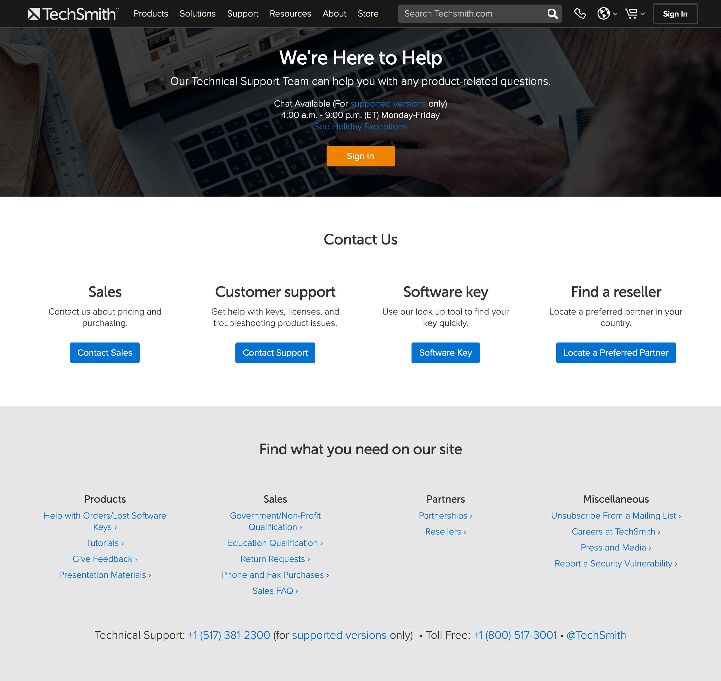 TechSmith offers a range of ways to get in touch with the company, including chat, telephone, email (via contact forms), and offers high-contrast buttons for particular user needs (Contact Sales, Contact Support, etc.). The company goes a step further by showcasing specific topics and concerns from its customer-support forums. Selling Internally to Multiple Stakeholders
Since B2B purchasing decisions usually affect many individuals inside an organization and often multiple people must approve the purchase, the buyer must:
- Understand the product well and be able to educate others about it
- Defend decision and answer questions about hypothetical situations to avoid risk
- Track and communicate approval from others
- Include others in any change-related conversations (about topics such as budget, solutions, contracts, etc.)
Recommendations
Clearly communicate what the product or service does, avoiding jargon (or defining it in place).
Write simply and show high-level information first. Then, as the user progresses (either by scrolling or by moving to a new page), offer more details. Consider how much information needs to be on a high-level overview page and make it easy for users to research details if they want to, by either offering another level of navigation or using clear labeling for links.
If you must use jargon, consider defining specialized terms wherever they appear. Keep in mind that people may land on low-level pages by search, so defining these only once on earlier high- level pages may not be sufficient. Even if your audience is well-educated, do not worry about insulting anyone’s intelligence by using plain language. No one has ever complained about a page being too easy to read. (But do use precise terms that are recognized by your target audience, even if they are complicated for others and may need an explanation.)
Clear copy builds trust because it tends to be perceived as honest and transparent, while convoluted writing is often received with skepticism. Complicated or jargon-filled writing can be perceived as written:
- by someone who wants to sound intelligent but may not actually be intelligent, or
- with the intent to mislead customers or to hide critical information.
Answer “what if” questions.
Provide easy access to FAQs, support pages, and forums. In other words, do not hide this information behind a login wall and make it available to prospective and current customers alike. Additionally, make it easy to send requirements to sales reps by providing a form which allows for attachments.
By answering these concerns upfront, the site can reassure uncertain users that the company can (and will) be able to resolve any potential issues that, further building trust and empowering users in their own efforts to persuade their coworkers or bosses.
Prove that the product or service works.
Give some context about the product service and prove its value to an apprehensive audience by offering information such as:
- Case studies and use cases: These are particularly helpful if your customers come from different industries. The more variety you have in your case studies, the more likely you are to address a wide range of concerns about your product or service. Case studies can also illustrate how to use the product or service in ways that the customer did not already think of.
- Testimonials: In many of our usability studies, testimonials are often noted as useful in the purchasing decision, because hearing an opinion from a fellow customer provides a sense that the product is right. Our research participants were especially sensitive to testimonials that started out with some sort of reservation then turned to confidence in the product (e.g., “I didn’t think this would work for me, but when I tried it I was glad I made the switch”). Our eyetracking studies also tell us that people care about who wrote testimonial: the author’s job title and affiliation. If you have a global audience, a relevant testimonial can establish relevance, and prove that the company can, in fact, work in places like Brazil or Italy.
- Product demos (screenshots, videos, or live demos): Showing the product in action is useful for many users, particularly for those who can’t download a demo because they have a device on which new software cannot be easily installed without approval (common for enterprise customers). Videos, screenshots, and demos (live or recorded) shed light on how the product works and illustrate specific use cases which are not easily explained in website copy.
- Free trials (without asking for a credit card): Users get excited about the word “free” and often will feel obligated to maintain their relationship with a company if they received some sort of benefit (such as a free trial) from the company. However, no user has ever been excited to provide their credit card information for a free trial. Most see right through this tactic and know that the company is depending on the users forgetting to unsubscribe or cancel the trial after it concludes. Instead, use an identifiable piece of information like email address to restrict account access.
Clearly convey the company’s values and any market differentiation.
It is a false perception that people “don’t read” the About or Company Values pages because they think those pages are just filler. In fact, when users are interested in establishing a long-term relationship with a company, they often want to ensure that it aligns with their own long-term needs and concerns, so they refer to pages with information about the organization and its values.
Our study participants say that seeing a physical location and humans behind the product or service bolsters their trust that the business is a legitimate one. These pages are a great opportunity to showcase images of the company employees and of its premises (if applicable), and also specific differentiators (like company values or technological innovations). If a company is clear about who it is and what it stands for, and users align with that, the company will strike a chord that will resonate with those users long past a single digital interaction.
Conclusion
By incorporating these guidelines, you can help users eliminate doubt and bolster trust. A great B2B site must be as simple, clear, and understandable as any great B2C site. Keeping a human-centered and empathetic approach is the key to building long-term trust with any customer.
References
Langer, E., Blank, A., Chanowitz, B. (1978). The mindlessness of ostensibly thoughtful action: The role of “placebic” information in interpersonal interaction. Journal of Personality and Social Psychology, 36, 635-642.
https://samplecic.ch/what-b2b-designers-can-learn-from-b2c-about-building-trust-2.html

 Right-to-left languages such as Arabic favor a reversed F-pattern, like the one seen in this study participant’s gaze plot, as he was scanning a page on an Arabic website. (Each blue dot signifies a fixation. The lines between the dots represent saccades in which the user is moving the eyes and is virtually blind. These lines help us to follow the sequence of fixations. Larger dots represent longer fixations and the numbers denote their order.) Spotted Pattern
 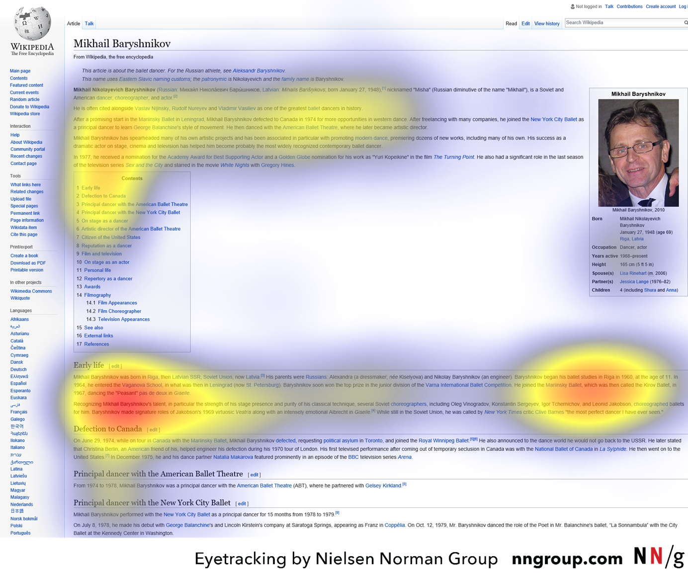 Caption: The heatmap shows an aggregate of six users who were using Wikipedia to learn about the dancer Mikhail Baryshnikov. The heatmap shows the F-pattern on the left and the spotted pattern on the right side of the page.
  Caption: A zoomed portion of the previous heatmap shows that the users were highly focused on the information about Baryshnikov’s education, which was their task. The digits 1960 probably attracted attention since users were trying to learn when the dancer began his education.
  Caption: A user researching hikes in South America on southamericabackpacker.com scanned directly to the short, bulleted list in each hike’s description. She probably found the content in the lists interesting or helpful since, after scanning the first bulleted list, she scanned to bulleted lists eight more times.
  A zoomed portion of the previous gaze plot shows the user scanning directly to the bulleted lists. Layer-Cake Scanning Pattern
  As he was researching how to winterize a boat engine on Yamaha.com, a user scanned to the subheadings, which appeared as bold, light blue text juxtaposed against the plain, black body text. Commitment Pattern
  The user was told she would be quizzed on the content in the article on nationalgeographic.com, and thus read almost every word, as the gaze plot shows.
  In this case, a user was highly interested in the topic and exhibited committed scanning on an article on theguardian.com. Summary
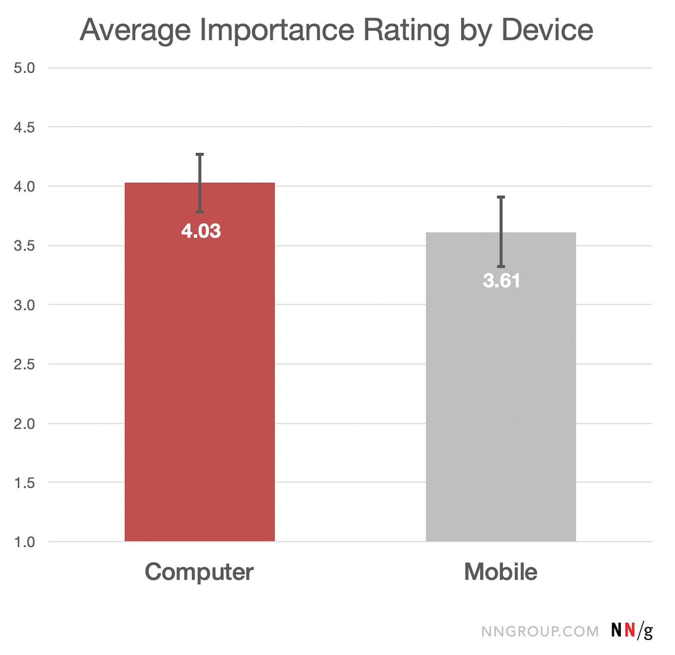
 This bar chart shows the average ease rating for activities performed on a computer/laptop (red) and, respectively, on a mobile device (grey). Activity ease was rated on a scale from 1 (very difficult) to 5 (very easy). Computer activities had an average ease rating of 3.96 out of 5, with a 95% margin of error of 0.22. Mobile activities had an average ease rating of 4.52 out of 5, with a 95% margin of error of 0.17. This difference is statistically significant by a paired t-test. Mobile Constraints Still Limit the UX for Complex Tasks
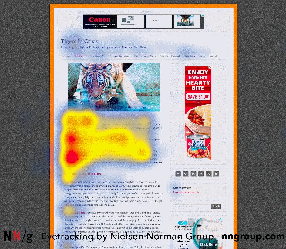
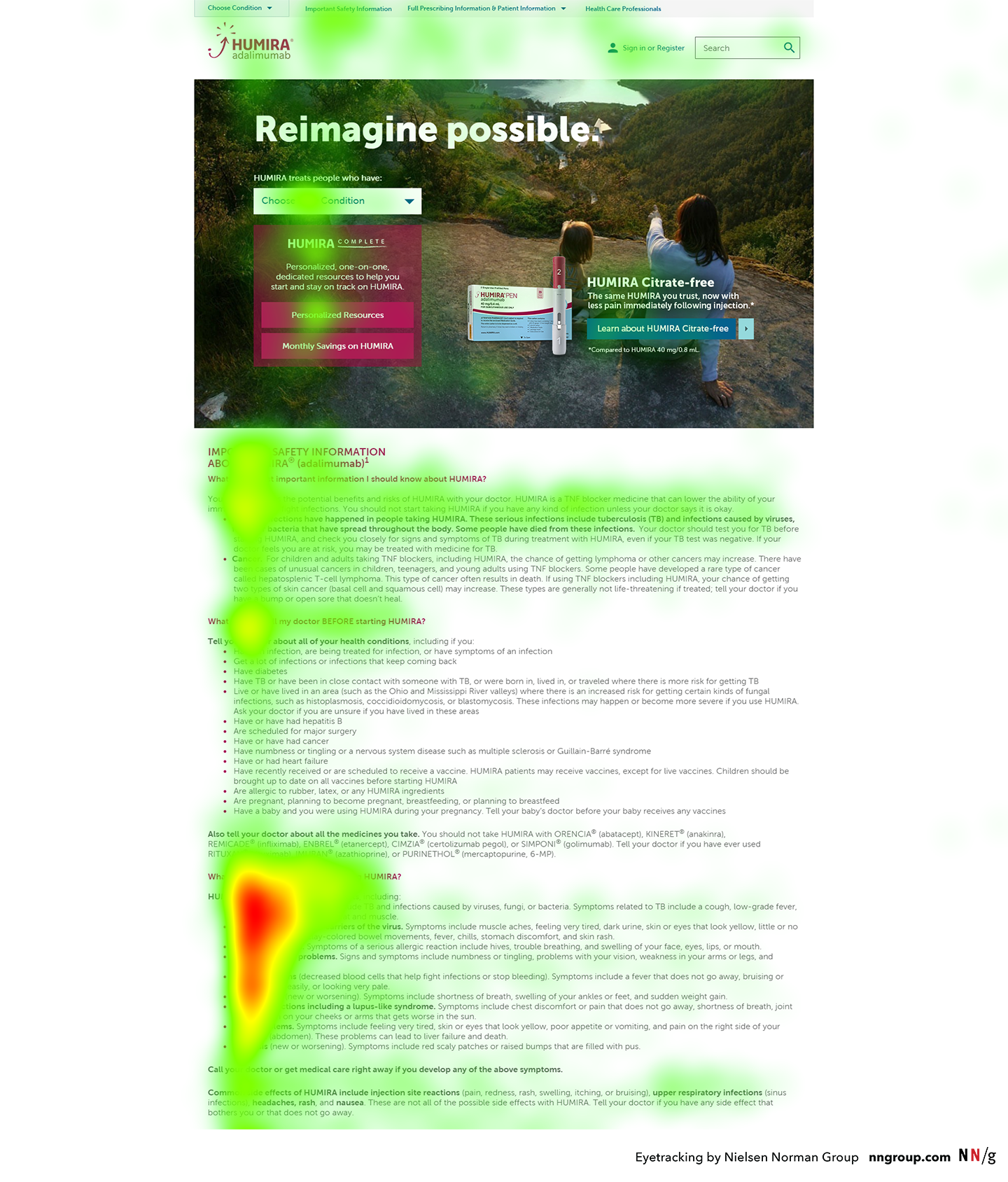 This heatmap is an aggregate from many participants performing the same task. The colored areas indicate where people looked, with red areas signifying the most amount of time, followed by yellow and green, respectively. To get this type of visualization, we recommend having at least 39 participants perform the same task on the same page.
 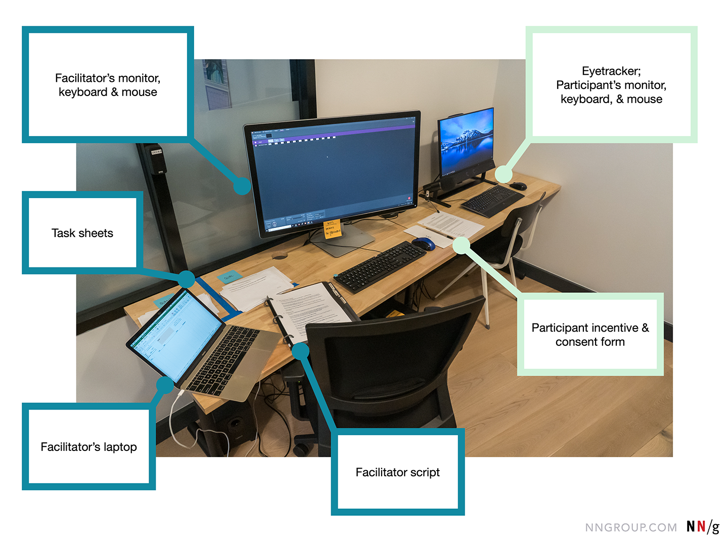 The facilitator’s monitor, keyboard, and mouse are set up to the left of the participant’s monitor, keyboard, and mouse. In this room, we chose to place the eyetracker in the corner because it was out of the range of direct overhead lights (which can sometimes cause problems with the tracking). The facilitator’s monitor was angled away from the participant, to prevent her from seeing it.
 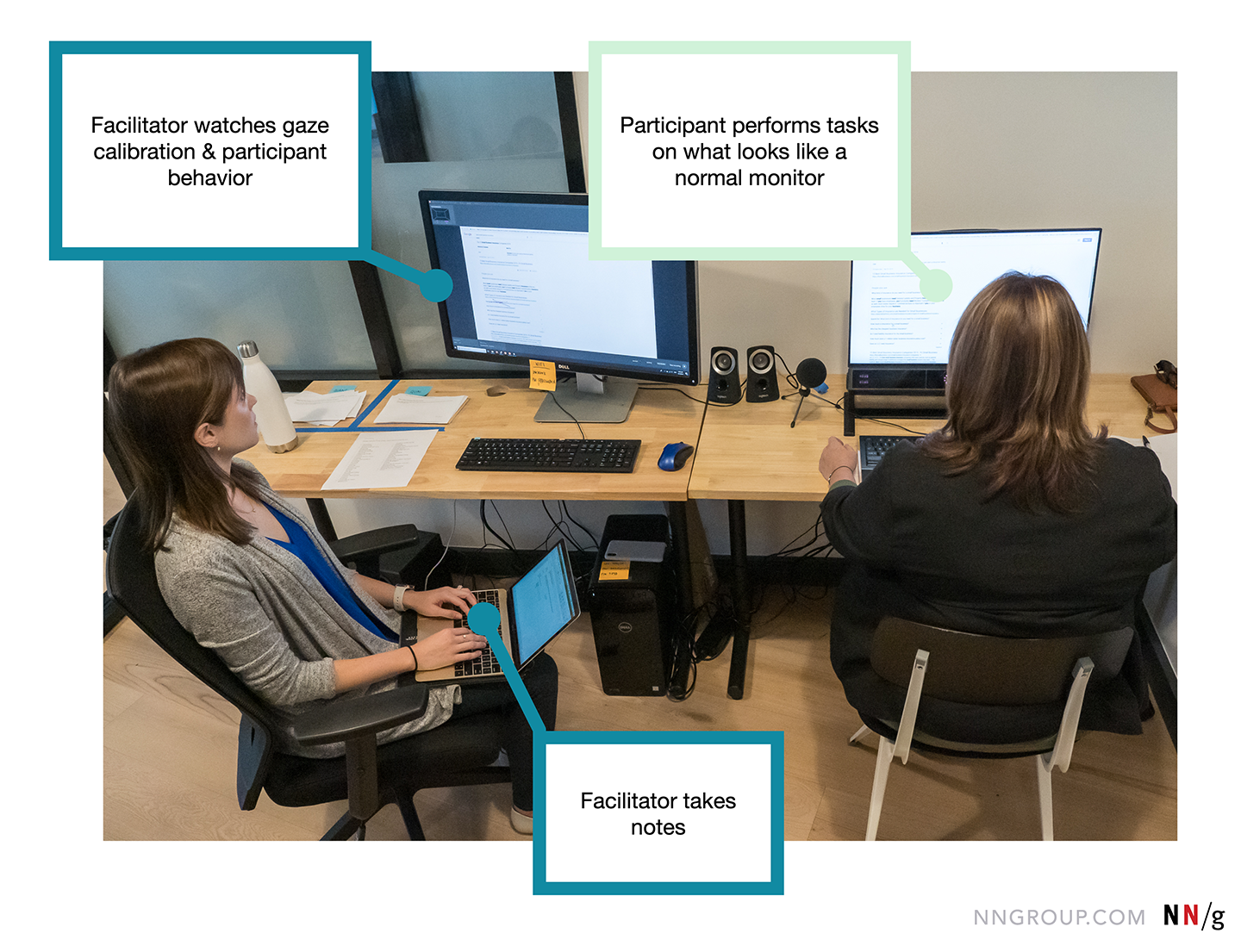 During each session, the participant (right) completed tasks using what looked to her to be a normal monitor. Meanwhile, the screen was shared on the facilitator’s screen with real-time gaze data. The facilitator (me, left) monitored the gaze calibration, watched user behavior, and administered tasks and instructions as needed. I also took some notes, but as eyetracking facilitation requires multitasking through many activities, those notes were very light. Primarily, I used my notes to record any issues I saw in the gaze data or to remind myself to go back and rewatch particularly interesting incidents. Human eyes move fast, so the bulk of eyetracking analysis work has to happen by slowing down the videos and watching them several times.
  This screenshot shows the facilitator’s view during a session. The white dots in the upper right corner represent the position participant’s eyes as seen by the eyetracker. If the dots disappear or move too far from the center, the facilitator knows she needs to intervene to save the calibration. The real-time gaze data is shown on the screen as red dots and lines (center). This provides another piece of information for monitoring calibration. For example, if the participant seems to be reading a headline, but the red dots are appearing a half-inch below that headline, that could be an indication that the calibration is off. Tables and Chairs
  In 2006 Kara Pernice (right) facilitated an eyetracking study with a very similar setup to our 2019 study. Tips for Your Eyetracking Study